Project objective
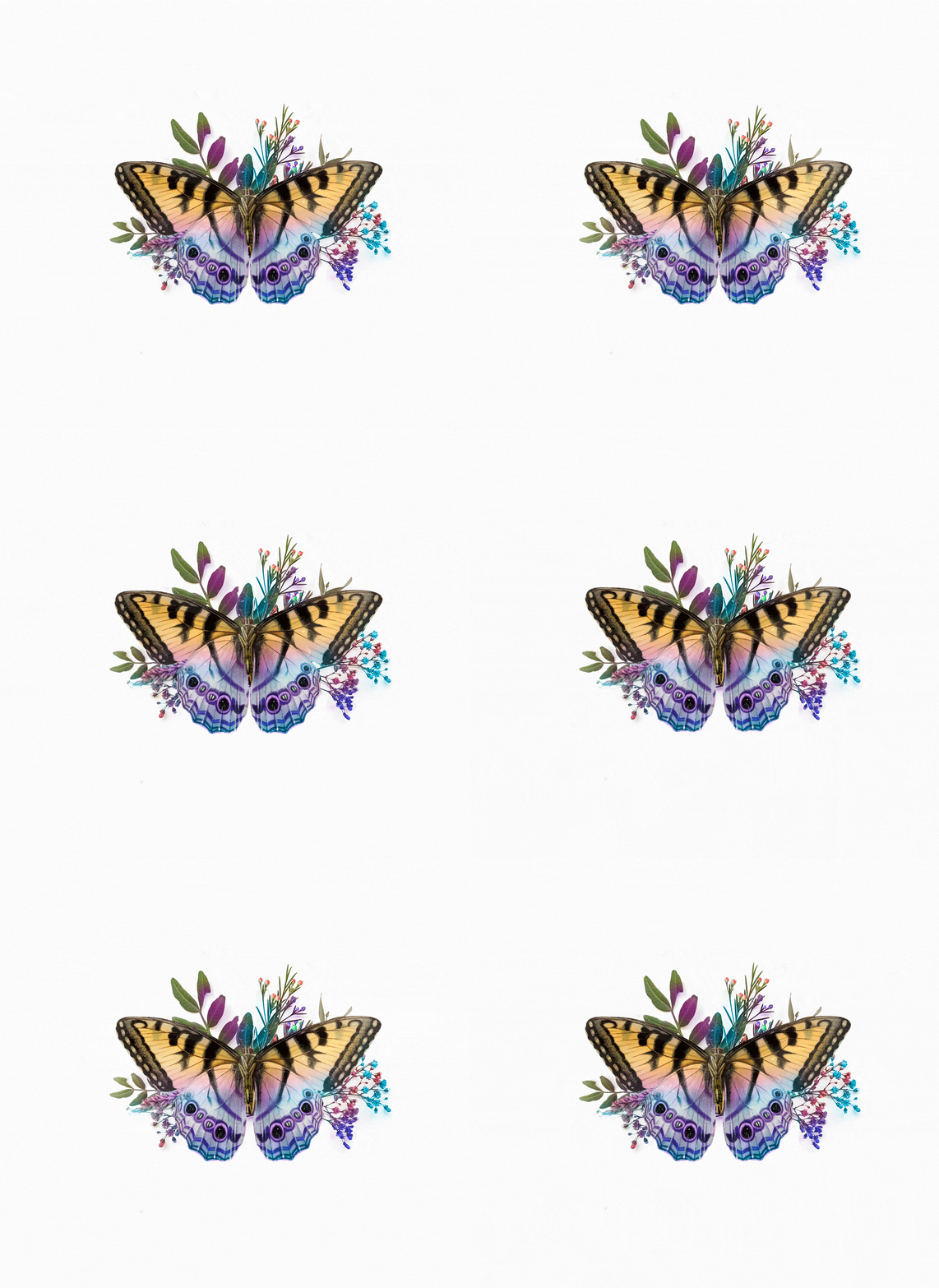
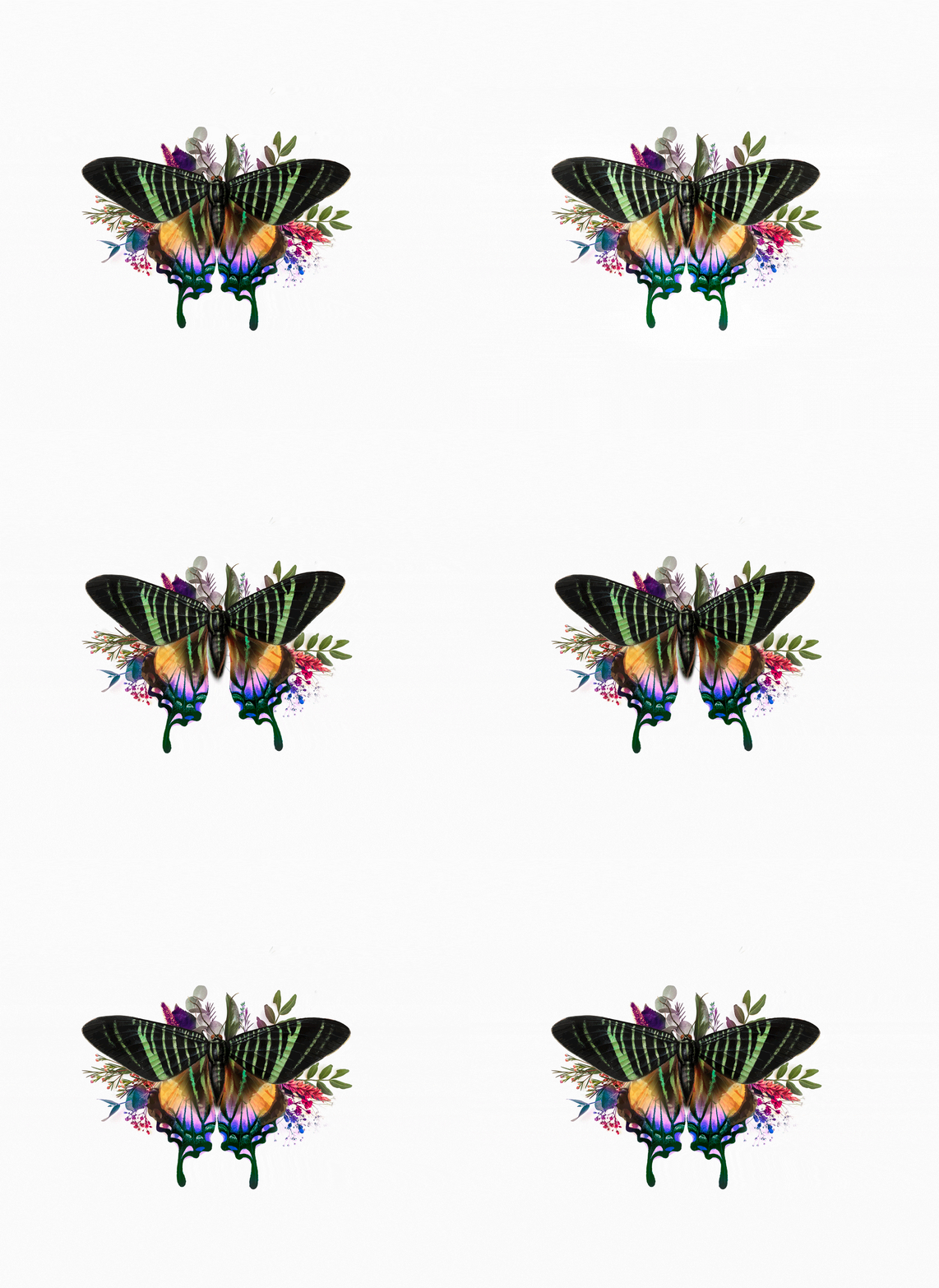
Butterfly Effect wine brand and label design is a straightforward private project for an alcohol distributor. The main concept revolves around capturing the essence of lightness and the fleeting moment of pleasure, excitement, and mystery.
In this project, the aim was to create a brand and label design that evokes a sense of delicacy and allure. The butterfly symbolizes transformation, beauty, and the interconnectedness of all things. By incorporating this symbol into the brand identity, a message of elegance and sophistication is conveyed.
Overall, the objective was to create a visual representation of the enchanting and captivating experience that comes with indulging in a glass of this exquisite wine. It invites consumers to immerse themselves in a moment of pure pleasure and mystery, making each sip a truly magical experience.
PRODUCT BRANDING • LABEL DESIGN • VISUAL IDENTITY
